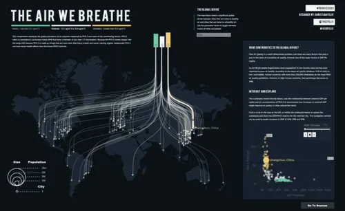
In today’s fast-moving world, we’re surrounded by information — reports, analytics, surveys, spreadsheets, dashboards. But raw numbers rarely tell a story on their own. What people truly connect with is clarity, and clarity often comes from visuals. A simple, well-designed graph can turn complex data into something understandable, relatable, and even memorable.
Whether you’re a student presenting research, a marketer tracking campaign performance, a business owner reviewing sales trends, or a teacher explaining a concept, the right visual can change the entire impact of your message.
How Data Becomes Meaning Through Visuals
Data visualization isn’t just about appearance — it’s about communication. When you translate numbers into a graph, you give your audience a chance to see patterns and understand context instantly. That’s why so many people today prefer to use a free graph maker to turn plain data into clean, approachable, and smart visuals that actually make sense. Instead of spending hours adjusting layouts in spreadsheets, you can focus on shaping the insight you want to deliver.
Turning Numbers Into Stories
Every dataset has a story hiding inside it — but your audience will only hear it if you show it well. Good visualization transforms charts from static images into meaningful narratives.
Think of it like this:
- A rising line shows growth.
- A shrinking bar reveals a problem.
- A pie slice highlights proportion and importance.
- A scatter plot uncovers relationships you might never see in a table.
For example, imagine tracking your monthly expenses. In a spreadsheet, the numbers feel flat. But when you visualize them? Suddenly you realize grocery spending spikes on specific weeks, or entertainment expenses have been creeping up unnoticed. A graph gives you perspective — and often, decisions become clearer.
Choosing the Right Graph Type Matters
Not all data fits in every graph. Picking the right format is part of telling the story well. Here’s a simple guide:
- Bar Graphs: Best for comparisons — perfect for categories like monthly sales, survey results, or performance between teams.
- Line Graphs: Ideal for showing changes over time — growth curves, progress tracking, seasonal trends.
- Pie Charts: Great for showing proportions — but avoid using too many slices.
- Scatter Plots: Perfect for highlighting correlations — like productivity vs. hours worked.
- Area Charts: Useful for cumulative trends and layered data.
When you match your data to its best visual form, your message becomes stronger, clearer, and far more persuasive.
Design: The Secret Ingredient to a Good Graph
A graph shouldn’t be flashy — it should be readable. True design is about enhancing meaning, not distracting from it. The most effective graphs share these traits:
- Minimal clutter. Remove anything that doesn’t support understanding.
- Consistent colors. Stick to two or three complementary tones.
- Readable labels. Every axis, point, and value should be instantly clear.
- Proper scale. Never distort the data by manipulating axes.
- Intentional highlights. Emphasize the single most important takeaway.
A clean design doesn’t just look nicer — it makes your audience trust the data more.
Real-Life Ways Good Graphs Make a Difference
Data visualization isn’t just for analytics teams or big companies. It benefits everyday situations too:
For students: Turning research findings into visuals can improve presentation scores and make arguments more compelling.
For entrepreneurs: A simple chart in a pitch deck can communicate momentum better than paragraphs of explanation.
For teachers: Visualizing concepts helps students understand faster and retain more.
For marketers: Showing campaign performance visually helps clients or teams make decisions with confidence.
For personal life: Budgeting, habit tracking, fitness progress — all become easier to understand when visualized.
Strong visuals don’t just inform — they empower.
Tips for Creating Graphs People Actually Understand
- Start with your message. Know exactly what insight you want people to take away.
- Remove the noise. Keep your graph simple and purposeful.
- Use color meaningfully. One highlight color can guide the eye perfectly.
- Label only what matters. Too much text is just as confusing as too little.
- Explain anomalies. Add a small note where something unusual happened.
- Test it. Show your graph to someone unfamiliar with the data — if they get it quickly, it works.
The Future of Data Visualization
We’re entering a time where visuals aren’t optional — they’re expected. Whether it’s social posts, reports, or presentations, people want information that’s easy to digest. Fortunately, tools are evolving to support this shift, making it simple for anyone to create professional-quality visuals without design experience.
As AI, automation, and digital content continue growing, the importance of quick, clear, human-friendly data communication will only rise. Visual literacy is becoming a modern skill.
Conclusion
Behind every dataset is a message waiting to come alive. When you turn numbers into visuals thoughtfully, you transform confusion into clarity and information into understanding. A good graph doesn’t just communicate — it connects.
Whether you’re informing, persuading, teaching, or simply exploring, remember: the right visual can turn data into meaning, and meaning into action.

